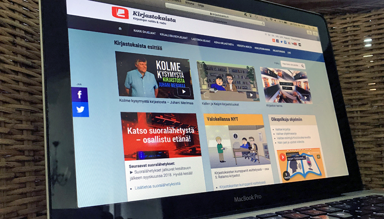
Librarychannel.fi’s user interface has been modified during the spring. The changes have made the site clearer to use and programmes are now easier to find. Additionally the site is now even faster to use.
Reorganized front page
The front page is a display window and calling card for Library Channel and its entire programme production. Elements that support searching the website have been highlighted and there’s now a place for live streaming on the front page while some social media embeddings have been removed. You can now watch live streams directly on the front page and get information about upcoming live streams. Also the video carousel of recommended videos has been replaced by selected videos from popular categories and series.
The new front page is more accessible and has more of the essential features gathered throughout the website. Also the different language versions are now in-line with each other so the Kirjastokaista, Bibliotekskanalen and Library Channel have the same information architecture and operation logic.
Clearer navigation structure
The content that Library Channel produces is divided into main categories and further into subcategories. The traditional dropdown menus have been removed from the navigation bar on the new front page. It has now been replaced by an uncluttered list of subcategories on each main category page. There’s a number next to each subcategory name indicating the number of media content included in that particular subcategory.
The goal is to make it easier to find certain programmes and to make the content of the pages more accessible.
Loading the listing pages is now faster
When a certain category is selected or a search is made, the media content will be listed on listing pages. These listing pages can be sorted by time, popularity or alphabetical order. The media content on the listing pages have been changed to include only the thumbnail and information of each media instead of each media having an individual player. Clicking the thumbnail or header will lead to the content’s own page where it can be played.
The goal is to make the listing pages lighter and faster to load by removing the individual players from these pages.
Hope you have a nice time watching the programmes of Library Channel! And remember that you can freely watch, show, share and embed all content that is on the Librarychannel.fi -website. More info about this on the FAQ-page.
For more information:
Riitta Taarasti, editor and producer, Librarychannel.fi, firstname.lastname(at)kirjastot.fi
Harri Oksanen, designer, Libraries.fi, firstname.lastname(at)kirjastot.fi
See also:
Kirjastokaista (content that has been spoken and / or translated into Finnish)
Bibliotekskanalen (content that has been spoken and / or translated into Swedish)
Library Channel (content that has been spoken and / or translated into English)
– Riitta Taarasti, June 15, 2018 –
Translated by Mikko Helander


